Harlow & James
Logo Design
This logo design for Harlow & James, a bespoke tailor based in Oxford, is a carefully crafted blend of classic elegance and modern refinement. Rooted in a tradition dating back to 1905, this design pays homage to the rich heritage of fine British tailoring while presenting a fresh and sophisticated aesthetic.
For this project, Harlow & James, established in 1905, sought a logo that could honour their rich heritage while appealing to a modern market. For over a century, the business relied on a simple traditional font as their visual identity – practical for its time but not designed as a true logo. With the rise of digital platforms and the need for a cohesive brand presence across both print and online spaces, they recognised the opportunity to create a logo that could represent their craftsmanship, timeless elegance, and forward-thinking approach. This new design bridges the gap between their storied past and their modern aspirations.
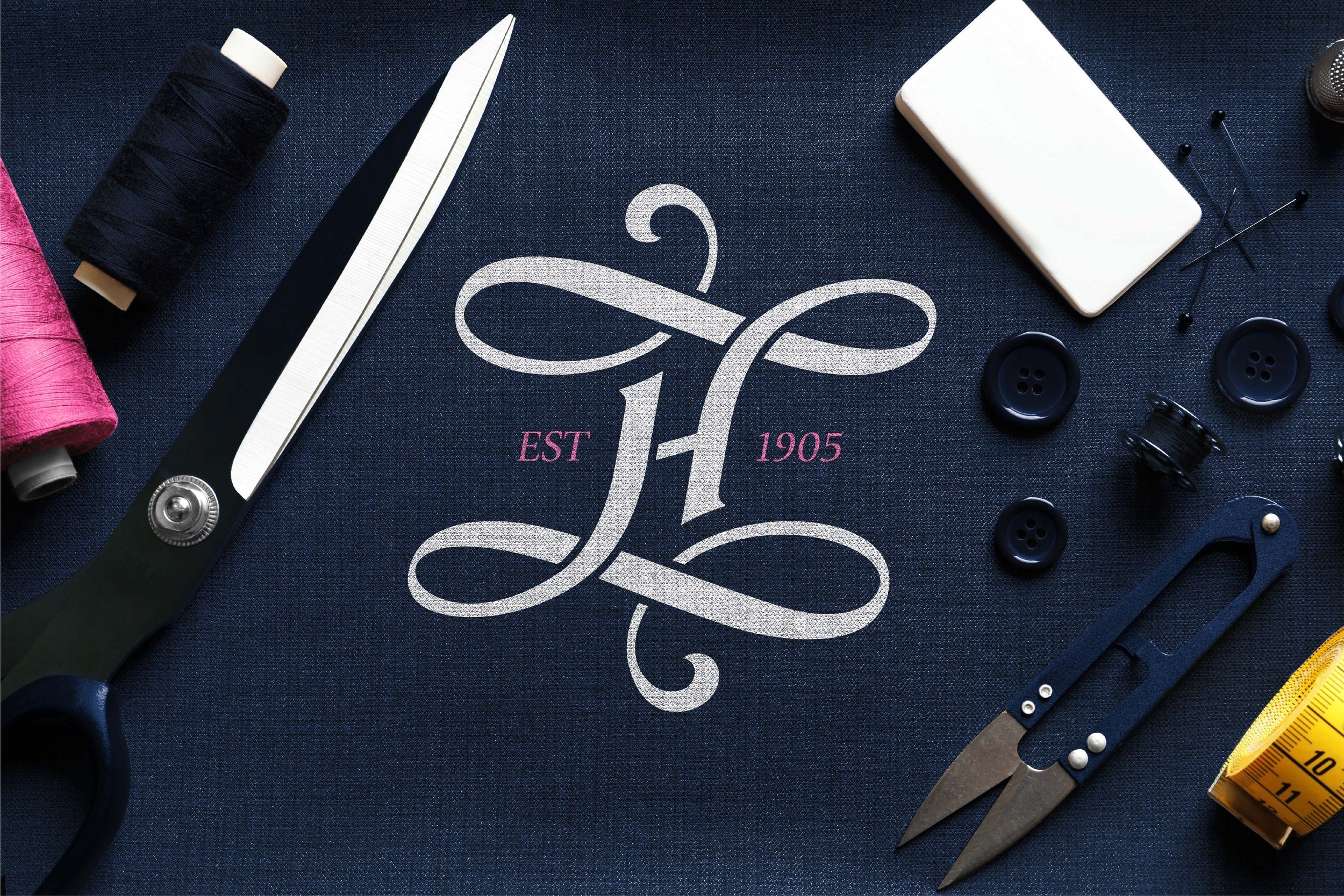
The focal point of the logo is an intertwined monogram formed by the initials 'H' and 'J', representing Harlow & James. This monogram is designed in a calligraphic style, evoking a sense of luxury, craftsmanship, and tradition. The flowing lines and curves in the monogram create a sense of timeless elegance, reminiscent of vintage bespoke tailoring logos, yet with a contemporary touch to appeal to modern sensibilities.
Colour Palette
The logo features a primary deep navy blue for the main text and monogram, symbolising sophistication, reliability and quality – qualities integral to the Harlow & James brand. Contrasting with this is a soft blush pink used for the supporting elements like 'EST 1905' and 'OXFORD'. This subtle accent adds a touch of refinement and approachability, balancing the formality of the navy with warmth and heritage.
Typography
The font choice for 'Harlow & James' is a classic serif, exuding elegance and professionalism. This traditional font anchors the brand’s identity in a sense of history and craft. The word 'OXFORD', placed below in uppercase and the blush pink accent colour, not only highlights the brand's prestigious location but also reinforces the heritage aspect with a subtle nod to the academic and sartorial significance of the city.
Summary
Overall, the Harlow & James logo is a sophisticated visual representation of the brand’s identity: a heritage tailor that embodies timeless elegance with a touch of modernity. It captures the essence of bespoke craftsmanship and positions the brand as both enduring and relevant in the contemporary market. This logo serves as a mark of quality and style that reflects the standards of tailored excellence upheld by Harlow & James.


