Gin & Bear It
Logo / Packaging
The Gin & Bear It logo is crafted to reflect the playful and approachable character of a small-batch gin brand, while capturing the spirit of independent craftsmanship and creativity. Designed with minimalism in mind, the logo combines a sense of whimsy with elegance, making it an instantly recognisable mark for this artisanal gin.
Design Concept
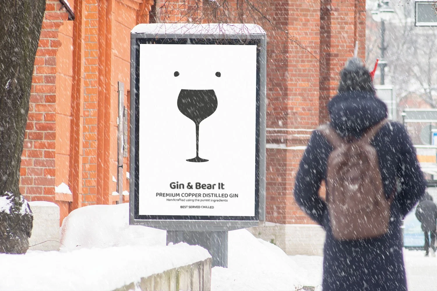
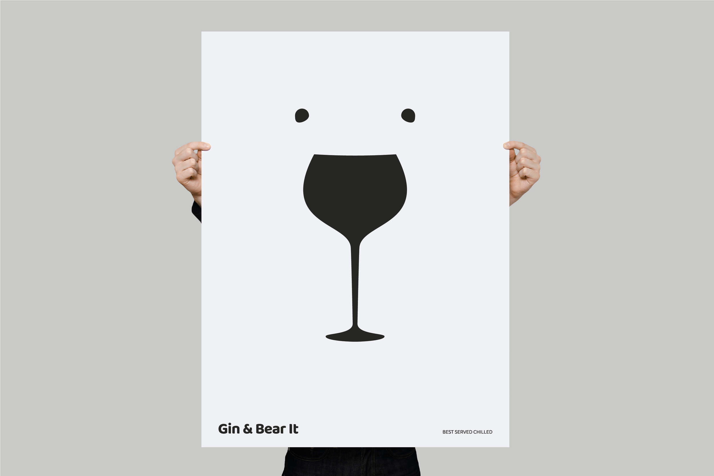
At the heart of the logo is a playful visual pun that combines a polar bear face with a gin glass. The gin glass silhouette doubles as the nose and mouth area of a stylised bear face, with two simple dots above representing the eyes. This integration communicates both the brand’s playful personality and its commitment to quality gin. The subtle humour behind “Gin & Bear It” comes to life visually, engaging the viewer and reinforcing the brand’s name in a memorable way.
Colour Palette and Style
The choice of solid black for the logo against a white background enhances the design’s simplicity and elegance, keeping the focus on the clever visual integration of the bear and gin glass. This monochrome colour scheme conveys a sense of sophistication and timelessness, appealing to gin connoisseurs who appreciate craft and subtlety. The minimalist design aligns with the brand’s independent ethos, suggesting that Gin & Bear It prioritises quality and originality over flashiness.
Typography
The font choice for "Gin & Bear It" is clean and modern, complementing the logo’s minimalist style. The rounded, slightly playful typeface strikes a balance between sophistication and friendliness, making the brand feel approachable while retaining a premium appeal. The tagline, 'Best Served Chilled', appears in a refined uppercase sans-serif font, reinforcing the notion of cool relaxation and hinting at the gin’s refreshing qualities.
Summary
The Gin & Bear It logo encapsulates the unique personality of a small independent distillery with a sense of wit and charm. Through its visual play and minimalist design, the logo communicates both quality and approachability. This design invites consumers to embrace the lighter side of gin enjoyment, aligning with the brand’s mission to create memorable, premium gin experiences with a touch of humour.


