Redmaine Saxby
Logo / Brand Identity / Digital / Print
A brand identity designed to embody the professionalism, trustworthiness, and elegance of Redmaine Saxby, an estate and letting agency.
Logo Design
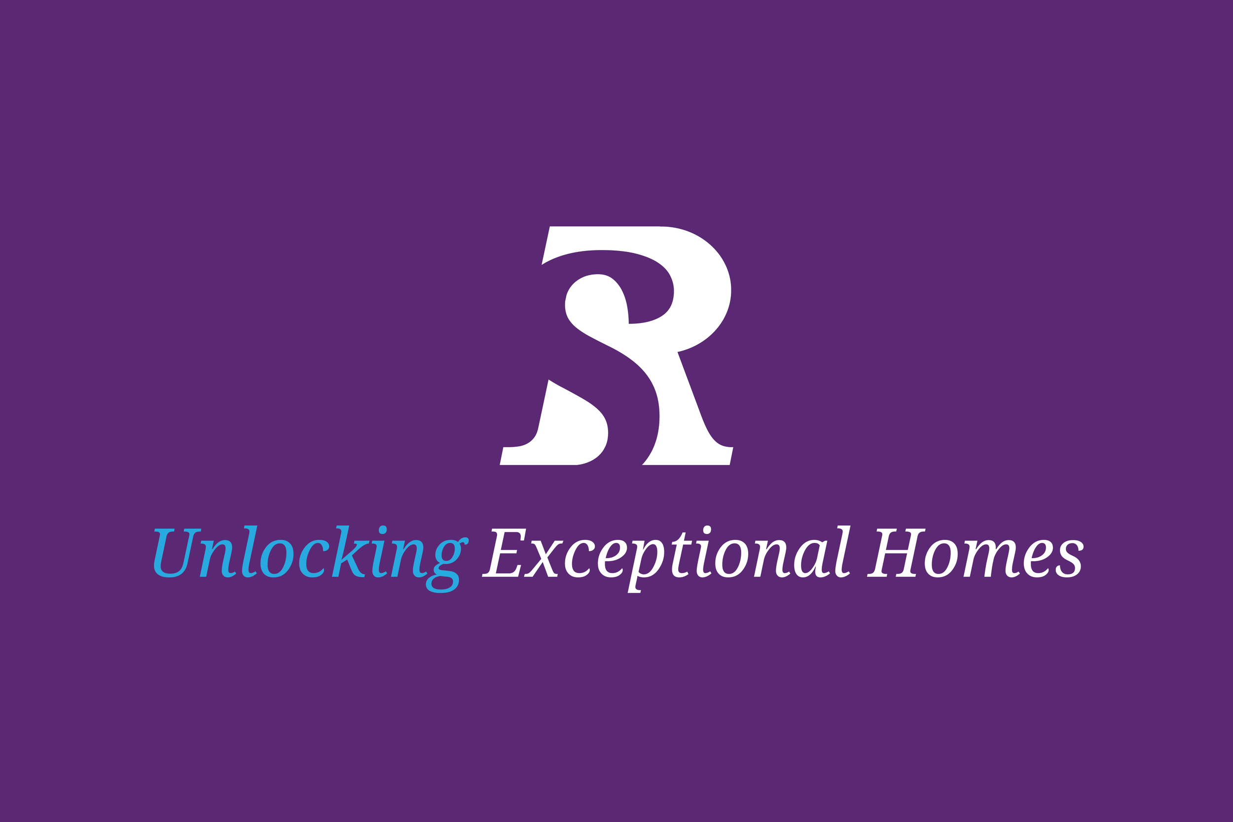
At its core is a unique monogram that creatively combines the initials 'R' and 'S' – the first letters of the business name. The 'S' is seamlessly cut out of the 'R', resulting in a visually striking and harmonious design that reflects both unity and distinctiveness.
The integration of the two letters symbolises the business partnership between the founders, Samantha Redmaine and Andrew Saxby. The design reflects their collaboration and shared vision for the brand, as well as the synergy between the agency's services, emphasising collaboration and continuity. The sharp, clean lines of the monogram give it a modern and professional look, while the simplicity of the design ensures that it remains timeless and versatile across various applications.
The rich purple background conveys a sense of luxury, trust, and authority – qualities that are crucial in the competitive property market. Complementing this is the soft blue accent, which adds a touch of warmth and approachability to the brand’s image.
Typography
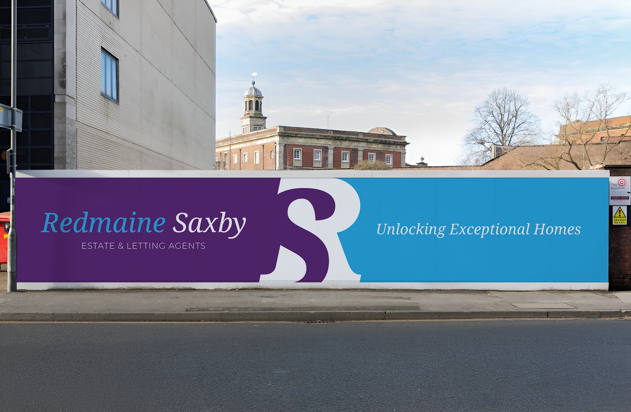
The typography further supports the brand identity. The serif font used for 'Redmaine Saxby' reflects heritage and tradition, while the modern sans-serif font for 'Estate & Letting Agents' ensures legibility and clarity and introduces a contemporary edge. Together, they balance the brand’s message of experience and innovation.
Key Features
Monogram Design
The combination of 'R' and 'S' is both creative and functional, serving as a bold emblem that works across all brand touchpoints, from signage to digital platforms.
Colour Palette
The pairing of purple and blue conveys a balance of luxury, trust, and approachability, appealing to a broad client base.
Versatility
The clean and minimal design ensures adaptability in various formats, whether scaled up for signage or down for digital use.
Summary
This brand identity encapsulates the professionalism and modernity of Redmaine Saxby, while honouring its foundational values of trust and collaboration. The 'R' and 'S' monogram not only creates a memorable visual identity but also reinforces the connection between the brand’s name and its mission to deliver exceptional service in the estate and letting sector.


