The Bridge Nursery
Logo / Print / Digital
The Bridge Nursery approached us with a unique vision for their brand identity, aiming to move away from the typical bright and playful designs often seen in nursery branding.
Instead, they sought a logo that felt warm, calming, and timeless – something that would appeal to both children and parents without relying on the usual colourful, cartoonish style. The goal was to create a design that reflected the nursery's nurturing atmosphere and its strong connection to the natural beauty of Whaley Bridge, Derbyshire. This approach guided the development of a logo that is understated yet inviting, conveying a sense of care, comfort and community.
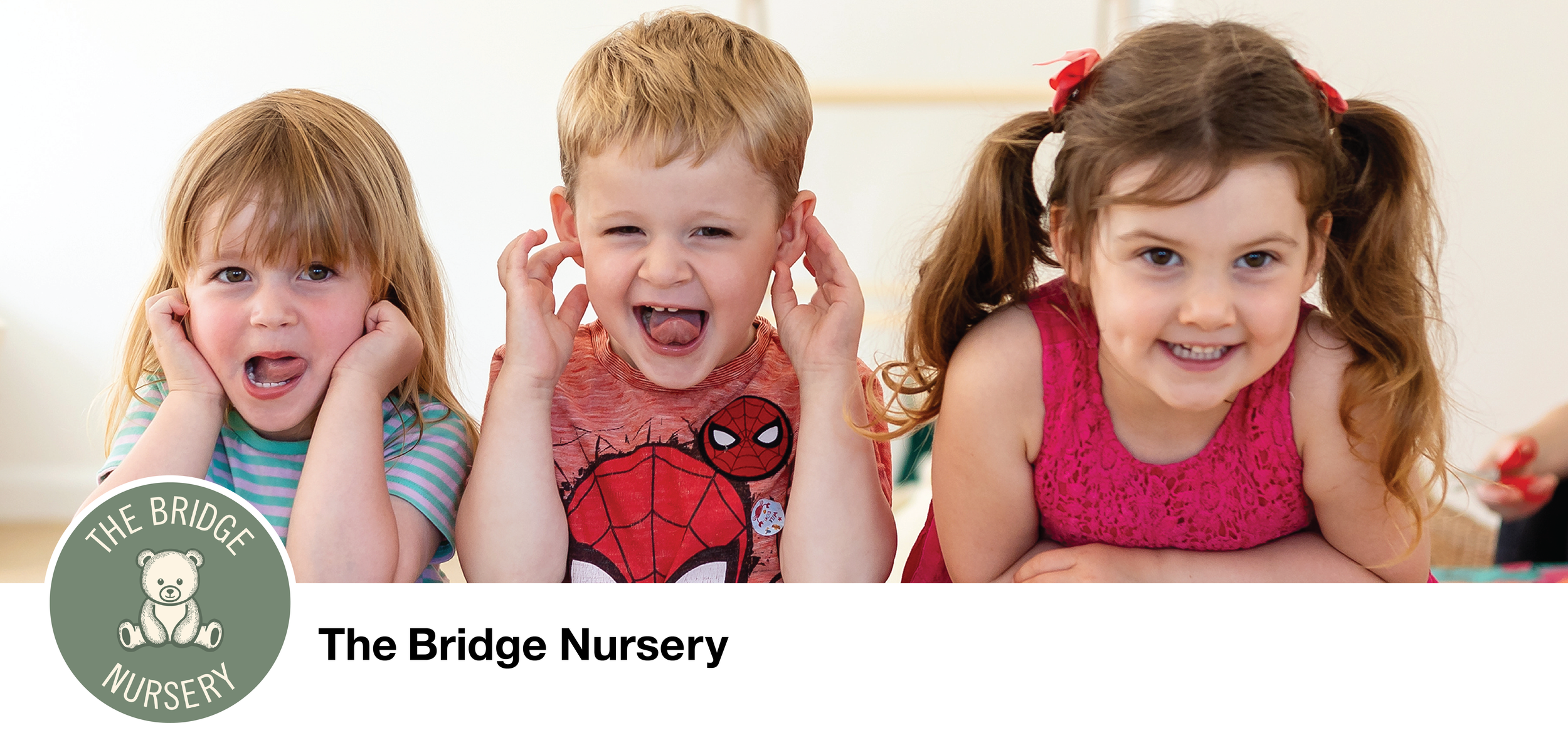
The logo is designed with a soft, welcoming aesthetic to capture the warmth and care associated with a children’s nursery. The layout centres around a simple, friendly teddy bear illustration, which is a classic, universally appealing symbol of childhood comfort and security. The bear’s design is minimal and slightly vintage in style, with clean lines and subtle shading, giving it a timeless look that appeals to both children and parents.
The choice of colour – a muted, earthy green – is calm and grounding, reflecting the natural beauty of Whaley Bridge, Derbyshire, where the nursery is located. This colour suggests a connection to nature and the value the nursery places on outdoor play and natural settings, resonating with the local environment. The soft contrast between the background and the cream-coloured bear and text makes the logo feel gentle and non-intimidating, an essential quality for appealing to young families.


