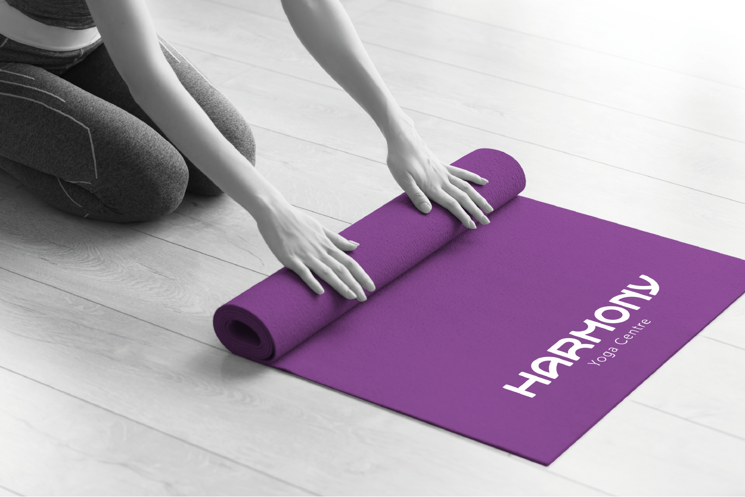
Harmony Yoga Centre
Logo / Brand Identity / Digital / Print
A brand identity design that embodies the tranquil yet energising spirit of yoga practice, designed to communicate balance, calm and unity. By using clean, flowing typography and a soothing colour palette, the logo creates an inviting, serene visual that reflects the values of Harmony Yoga.
Logo Design Concept
The design centres on a customised, modern typeface with gentle curves and balanced forms, reinforcing the theme of harmony. Each letter flows with a natural rhythm, mirroring the fluidity and connectivity found in yoga, while the shapes allude to a sense of movement and flexibility, which are key qualities of yoga practice. This smooth and continuous design aims to evoke a sense of flow, helping the viewer immediately feel a sense of calm and alignment.
Typography
The custom font in 'HARMONY' has been carefully crafted to reflect both stability and fluidity. The rounded, open shapes of the letters are designed to convey an approachable and nurturing tone, appealing to a wide range of yoga practitioners. The secondary text, 'Yoga Centre', appears in a light, sans-serif typeface that complements the main text while enhancing the overall minimalist aesthetic.
Colour Palette and Style
The deep purple background is chosen for its associations with calmness, spirituality, and mindfulness – qualities that are integral to yoga and meditation. Purple also stands out as a colour that promotes introspection and balance, aligning well with the studio’s mission to help clients find inner peace and strength. The white font against the purple creates a pleasing contrast, making the logo highly legible and visually striking.
Summary
The Harmony Yoga Centre logo is a visual expression of peace, balance, and unity, all of which are essential components of yoga practice. Its clean and flowing design seeks to welcome individuals from all backgrounds, creating a calm yet dynamic symbol for a space dedicated to personal growth and well-being. The logo encapsulates the brand’s mission to guide clients towards harmony within themselves, making it a perfect visual representation for a place of healing and transformation.


