Ginge & Co.
Logo / Brand Identity / Packaging / Print
Ginge & Co. is a father & daughter business making homemade ice cream in New Mills, Derbyshire. We worked with them to create a brand that perfectly captures their fun, wholesome, and handcrafted approach to ice cream making. By blending vibrant personality with clear visual storytelling, the design conveys a sense of joy and authenticity that appeals to both children and adults alike.
Logo Design Concept
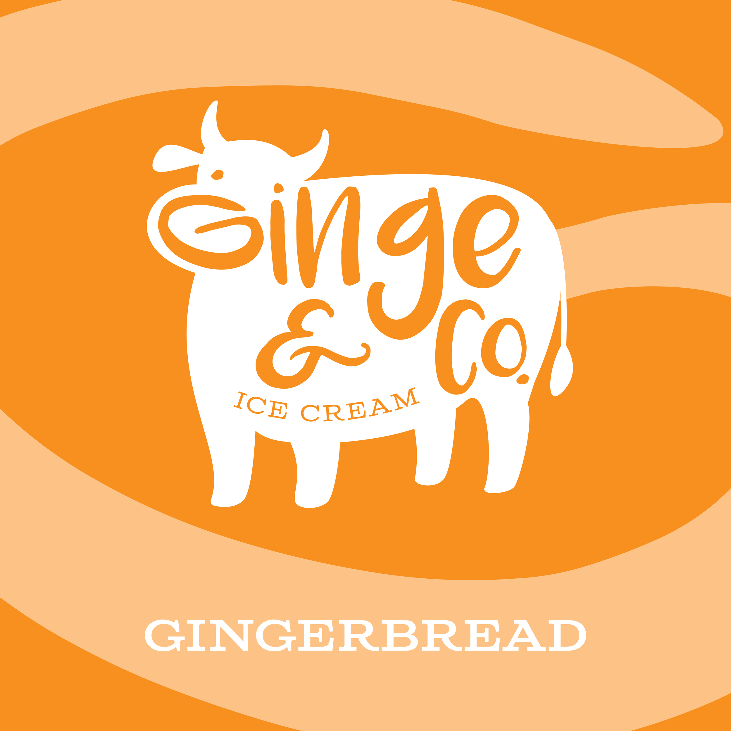
At the heart of the design is a stylised cow silhouette, representing the natural, dairy-rich foundation of the ice cream. The cow is both approachable and friendly, emphasising the brand’s connection to high-quality, farm-fresh ingredients. The use of rounded, hand-drawn letterforms for the brand name, 'Ginge & Co.', gives the logo a warm and informal charm, reflecting the artisanal and small-batch nature of the product. The addition of 'Ice Cream' in a playful yet classic serif font adds balance and clarity while reinforcing the brand’s focus.
Packaging Design Concept
This packaging design was a concept produced to showcase the logo. The swirling background pattern, derived from the logo – the ‘G’ in 'Ginge', which forms the cow’s nose – symbolises the harmonious blend of ingredients that make up the ice cream. This element adds a layer of storytelling, subtly connecting the logo with the product’s essence. The swirl also introduces a sense of movement and playfulness, reinforcing the light-hearted and fun nature of the brand. By pairing bold, curved shapes with the clean white of the cow logo, the design achieves a balance between simplicity and visual interest, drawing the eye naturally toward the central branding. This cohesive use of colour, symbolism, and form creates a memorable and inviting packaging design, resonating with the rich and comforting flavours of the product.
Colour Palette
The colour palette of orange and white was chosen to reflect the brand’s identity and evoke a warm, inviting feel. The bold orange serves as a nod to the name 'Ginge', tying the colour directly to the brand’s playful personality and unique character. The use of white, on the other hand, symbolises milk and purity – milk being the key ingredient in ice cream and purity reflecting the use of fresh ingredients and the brand’s association with cleanliness and quality. Additionally, the colours are versatile and can be reversed depending on the application, ensuring the design remains flexible and impactful across different packaging, marketing materials and brand touchpoints.
The Ginge & Co. logo is a playful, cohesive design that encapsulates the brand’s essence – fun, friendly, and high-quality artisanal ice cream. Its integration of typography within the cow silhouette creates a unique, recognisable identity that stands out on packaging, signage, and promotional materials. The design effectively communicates the joy and craft behind every scoop, resonating with customers and inviting them to indulge.


